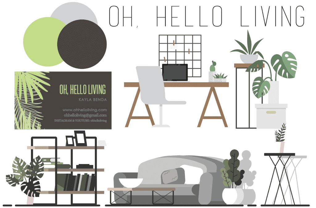
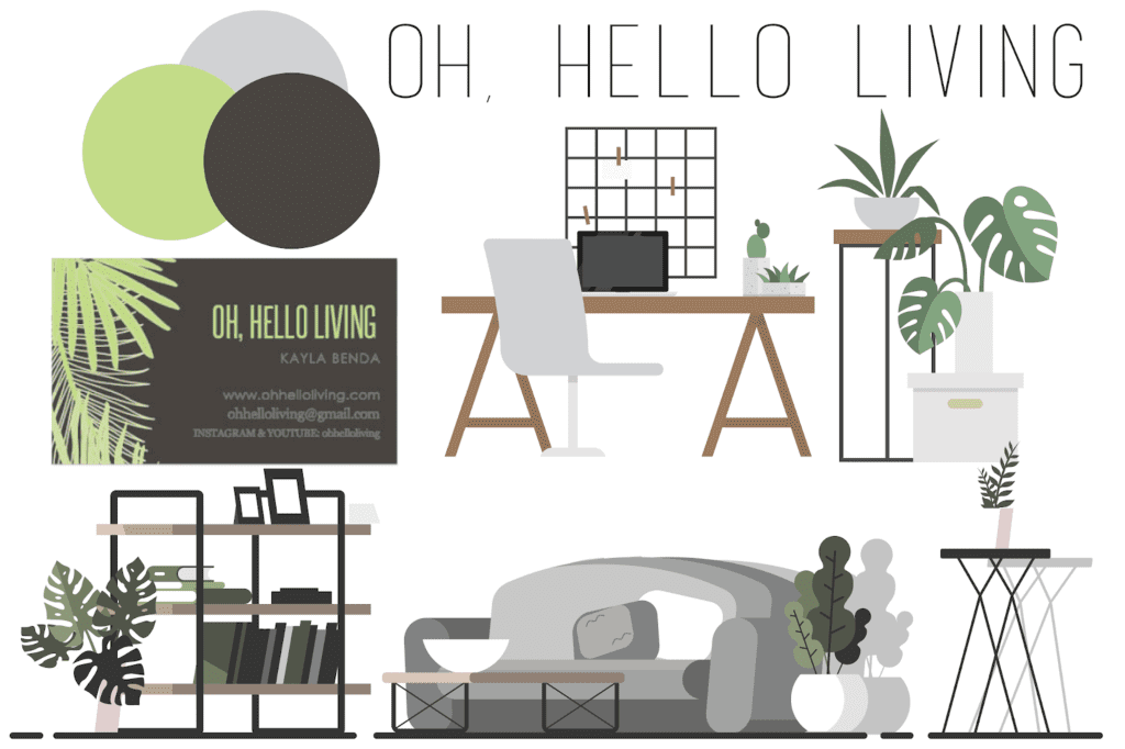
One of the very first things I did before 2019 hit is to finally get my blog brand in order. The name change was just part of the larger picture to get a more cohesive brand identity. Now that all my back links have been fixed and redirects are in order, I thought I’d share with you how I built my brand toolkit to better convey what my blog is all about. It’s honestly a lot easier than you think.
1. Define your brand’s story or identity. What is your blog/company about? What’s its mission? If someone were to describe your site in a few words, what would they be? What are things that interest you? I have a serious love for plants, minimalism, and modern design. I wanted all of those elements to come through in my new branding. My blog is all about making your life simply beautiful through planning, organization, and business tips. Sure I throw in the occasional board game review here or there, but the overall message is clear.
2. Define your official brand name/logo. If you already have your name and logo, great! For me, Microscope Beauty just did not fit my brand’s story or identity anymore so I needed to switch it up. I chose Oh, Hello Living because it coordinates well with my main company Oh, Hello Co., but also has more of a lifestyle feel to it. If you haven’t figured out your name yet, take your brand’s story and brainstorm some ideas that clearly embody your brand identity. Leave yourself room for growth with your name too. You don’t want to call your blog “Cooking with Casey” when a few months down the line you might want to expand into book reviews.
3. Explain your logo and how it should be used. Once you have your name and logo, give clear rules as to how that logo should be used. Oh, Hello Living for example is a straight across line of text. Decide now if you’re ok with the text being broken up into separate lines, or if you want to be more strict with your brand.
4. Brand color palette. This is definitely my favorite part of the brand toolkit process and the easiest one for me. Choose at least three colors that represent your brand. Have two main colors, and a few supporting colors as well. These colors you’ll use across everything so make sure you pick ones that look good together and help share your brand’s story and identity.
5. Fonts that fit your brand identity. While building your toolkit it’s also super important to pick which fonts you’re going to use to represent your brand. You don’t want employees or yourself down the road getting willy nilly with the font. Choose a nice serif and sans-serif font and maybe one or two other options. That way you’ll have a cohesive brand look across any platform.
6. Supporting visuals and information. Think of this as the mood board for your brand. Whether its tangible or digital, find images and elements that help to communicate your brand’s story. The simplistic home drawings of my brand can be seen over all of my various platforms so you know you’re on an Oh, Hello Living site when you’re there. Using cohesive elements gives your audience a better understanding of your brand and makes it easier for them to recognize at a glance.
I recommend opening up Illustrator or even a Microsoft Word document and dragging different elements, fonts, and colors into one place so at the end of these steps, you have your brand toolkit all in one place. Print it off, pin it up somewhere so you can see, and get the year off on the right foot with a more cohesive brand.


