I think it’s safe to say we all struggle with blog photography. Even the pros constantly say how it’s the hardest part about blogging. From trying to get the right lighting to keeping photos engaging, I still struggle after nearly four years of doing this. So here are some of my tips and tricks on making blog photos better.
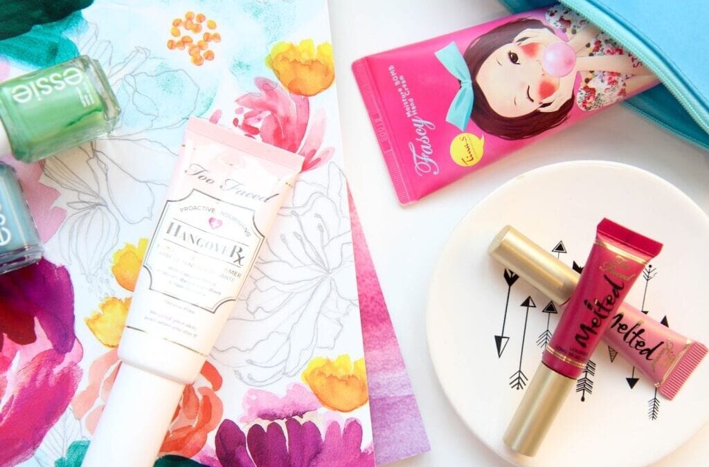
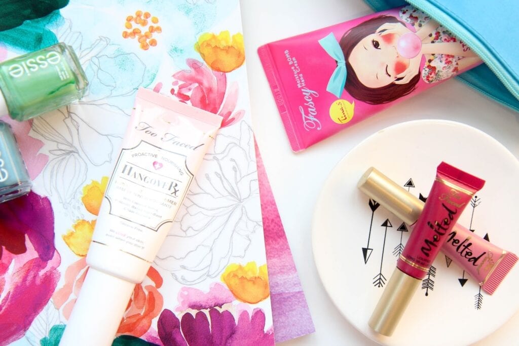
Starting out I never considered how important props are to a photo. Adding notebooks, dishes, color coordinated makeup, you name it. Even if it’s not even what you’re specifically talking about, adding extra elements into a photo can make it more engaging and interesting to look at. I have a bin filled with random makeup bits, nail polish, and stationery that I keep on hand where I usually take my blog photos. If I find anything out and about I’ll pop it in the bin specifically for photography. You could easily use things you have around the house, but I find it just easier to use them specifically for blog photos. The Target Dollar Spot is my favorite place to find really cheap, cute accessories to add into photos. They constantly have dishes and stationery supplies.
If you’re getting tired of your photographs, change up your background textures. I’m currently in a bright white background phase, but when I get tired of that I’ll move into the kitchen for the hardwoods or a bathroom for interesting tile. Counter tops and blankets also make for a really interesting backdrop. Plus if you don’t have any spare cash to buy some cute photo props, then this trick can really spice up you photographs. Combining props and background textures is also a really fun combo.
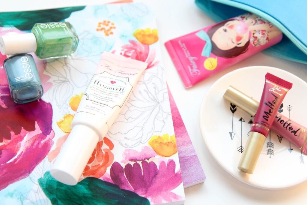
In a world filled with flat-lay photography, try changing the angle of your photograph. This photograph below is the exact same set up as the one above, but at a slightly lower angle. Just tipping the camera down slightly can create a completely different photo with different focal points.
Whenever I take my photos I always try a few different combinations so when in editing I can pick and choose which ones work best for the post I’m creating. I’ll take a horizontal and a vertical photo for each post because just changing the orientation can completely change the photo. Vertical allows for a lot more to fit into the photo so it works better for posts about more products. Horizontal really draws the viewer in to get the details of what you’re talking about. Next I take a straight-down flat-lay photo and then take a few more at different angles. I even go as far as to take a photo from the side just to see how it might look. As long as your main subject is in focus, you can really mess around with angles to get the best results.
There are tons of photography tips and tricks out there and I even have another one coming to debunk some of the preconceived notions about how to get good blog photos. The best thing you can do is keep snapping away and work on your skills. Photography really is all about the practice and you only get better with time.


